 Logobundle
How to vectorize a logo (PNG or JPG to SVG)
Updated · 12 min read
To convert a PNG logo to SVG, you trace it: software finds the edge of each colour and redraws it as vector paths. You can do that by hand in Inkscape or Illustrator, or upload the PNG to Logobundle, which removes the background, flattens the colours and traces it in one step. This guide shows what traces well, how to prepare the PNG, both routes, and how to check the SVG you get. Only need the files? Use the logo to SVG converter.
A real result
On this page
What converting a PNG to SVG actually does
A PNG is a grid of coloured squares. A 1024 px logo has about a million of them, and the file knows nothing about shapes: only that this pixel is orange and the next one is white. Scale it up and the squares get bigger, so the edges turn soft or stepped. An SVG stores the shapes themselves: a few points per outline, joined by curves, each filled with one colour. A browser or printer draws those curves fresh at whatever size it needs, so the edges stay sharp on a phone and on a banner.
Converting a PNG to SVG therefore means tracing. Software looks for the edge of each colour area and fits curves along it. The result is a new drawing that follows the old one. It is not the PNG wrapped in an SVG file, and it is not upscaling. An upscaler, AI or not, makes a bigger PNG with more pixels. It still blurs past its new size, you still cannot recolour it shape by shape, and a vinyl cutter still cannot cut it.
Tracing is only as good as the shapes it can find. A logo with a few flat colours and clear edges gives clean paths. Anything soft, such as glow, texture, a shadow or a photo backdrop, has no edge to follow, so the tracer has to invent one. The next section shows what that looks like on real uploads.
What traces well and what does not
We ran four uploads through Logobundle's tracer as they were, without clean-up and without the AI boost. One is a flat logo. The other three are the kinds of images people often upload as their logo.
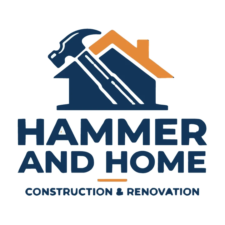
Flat colours
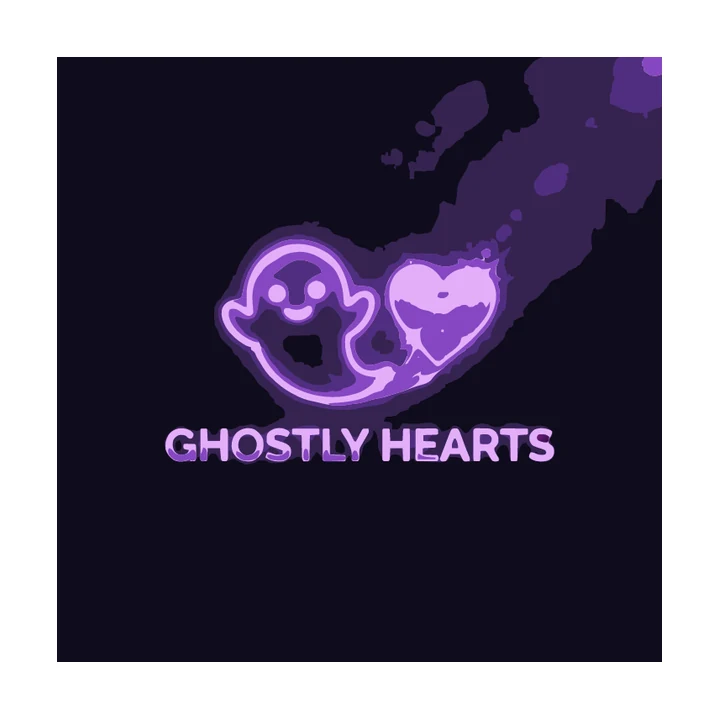
Glow on a dark backdrop
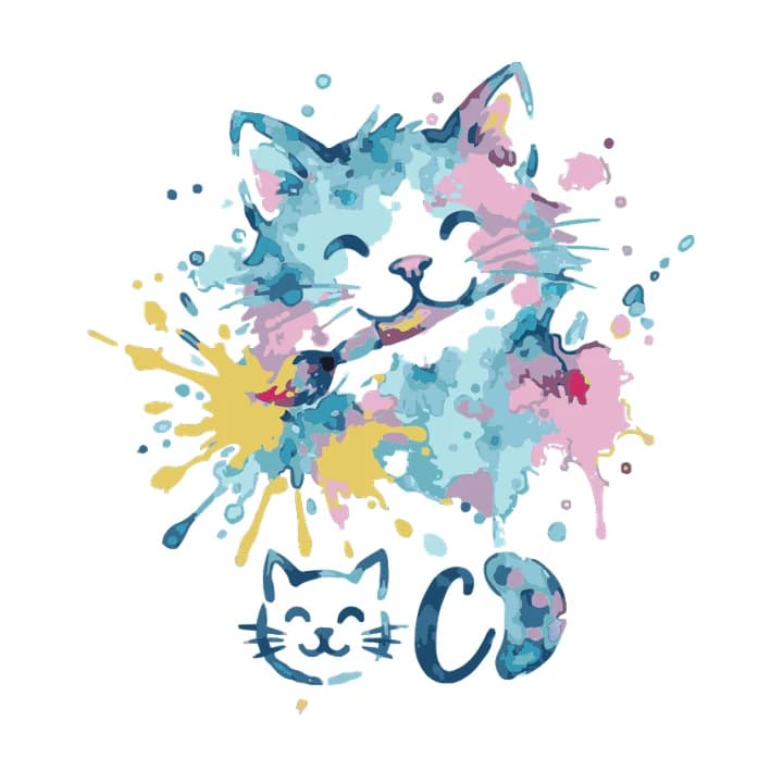
Watercolour
Grunge texture
- Flat colours (✓): two colours, solid fills and bold letters. Every edge is clear, so the trace keeps the house, the hammer, the roof and even the small line of capitals underneath.
- Glow (✗): the glow fades into a dark backdrop, so there is no point where the logo stops. The trace keeps a dark square, purple smears and a blotchy heart. Ask for the logo without glow, on a plain light background.
- Watercolour (✗): every brush stroke is a colour of its own. The cat becomes dozens of pale blue and pink patches with dots around it, and the rainbow splash ends up mostly yellow. Trace a flat version of the idea instead.
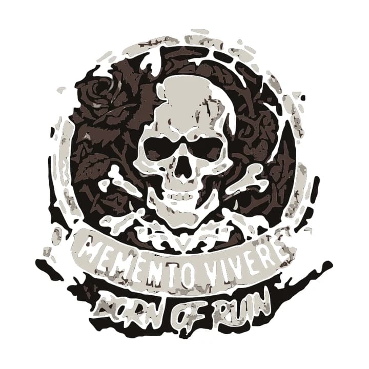
- Grunge (✗): the scratched texture breaks every shape into fragments, the red rose turns dark brown and the lettering is full of holes. A vector logo cannot keep that texture, so remove it before tracing.
Prepare your PNG before converting
Most bad traces are fixed before the trace, not after it. Two problems come up again and again: colour ramps and mockups.

As uploaded
Traced as is
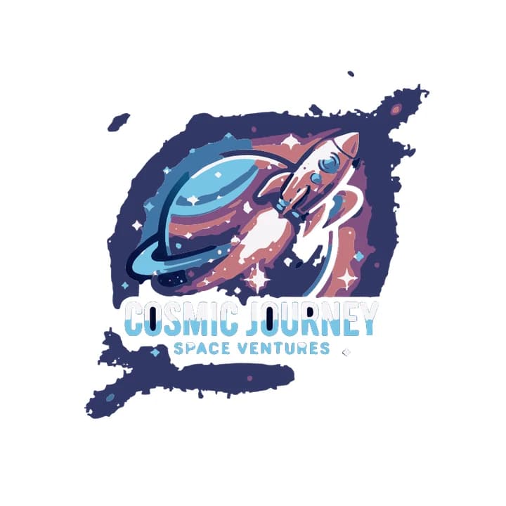
The planet and rocket are shaded with smooth colour ramps and sit on a starry sky with a glow behind them. In the trace the ramps are gone: the planet is a flat blue disc with lighter patches, the flame is pale pink, the rocket a muted pinkish brown, and the gradient in the title splits into two flat bands. A ragged dark-blue blob of the sky stayed around the art, because the glow hides where the backdrop ends. Logobundle keeps a clean ramp as a real SVG gradient when it can fit one. Here the ramps overlap with sparkles and glow, so it could not. Flatten the shading, or ask the generator for solid colours.
Mockup as uploaded
Traced as is
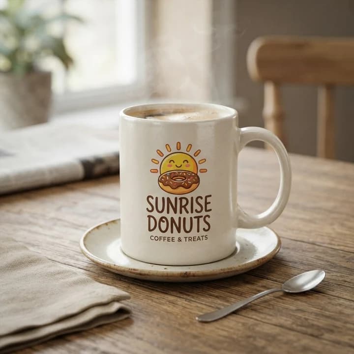
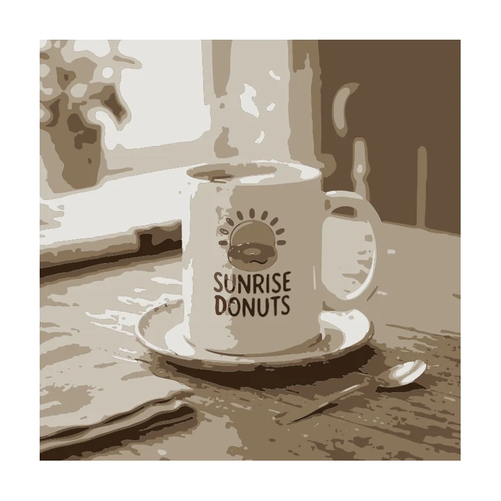
A mockup traces the whole scene. The result is a sepia picture of the table, window, saucer and spoon. The logo survives only as brown lettering and outlines on the mug: the yellow of the sun is gone, and the small "Coffee & Treats" line has vanished, because the tracer had to share its few colours with the room. Crop to the logo first, or better, use the flat original the mockup was made from.
- Resolution: use the largest, sharpest original you have; blur has no edge to follow, so it traces as lumpy outlines. Around 1000 px on the long side is enough for a logo. Upscaling a small or blurry file rarely rescues it: the upscaler guesses the edges for you.
- Background: plain white or one flat colour. Crop away mockups, paper, shadows and photo backdrops.
- Colours: count them. Two to six flat colours trace well. Remove glow, gradients and texture you do not need.
- Text: very small lettering can lose thin letters. You can set a tagline in a real font after tracing.
Got a PNG that passes these checks? See its trace in about a minute.
Convert it by hand: Inkscape, Illustrator and free converters
You do not need Logobundle to trace a logo. Inkscape is free and Illustrator is the industry standard, and both trace well when the PNG is clean. Neither removes a mockup backdrop or merges near-identical shades for you, so run the checks in Prepare your PNG first. The steps below are for Inkscape 1.4 and Illustrator 2025.
Inkscape (free)
- 1Open the PNG with File → Open. When Inkscape asks how to import it, choose Embed. Click the image to select it.
- 2Open Path → Trace Bitmap… and switch to the Multicolor tab.
- 3Set Detection mode to Colors and Scans to the number of colours in your logo, plus one for the background.
- 4Tick Smooth and Stack. Tick Remove background if the backdrop is plain. Click Update preview to check.
- 5Click Apply. The paths land as a group on top of the bitmap.
- 6Drag the group aside, select the bitmap underneath and delete it. Delete any stray specks.
- 7Save with File → Save As… and choose Plain SVG as the file type.
Adobe Illustrator
- 1Place the PNG with File → Place and select it.
- 2Open Window → Image Trace.
- 3Set Mode to Color and Palette to Limited, then set Colors to the number of colours in your logo.
- 4Open Advanced. Raise Noise to drop small specks, raise Corners for geometric shapes and adjust Paths for how closely the outlines follow the pixels. Tick Ignore White to leave out a white background.
- 5Tick Preview to see changes, then click Trace.
- 6Choose Object → Image Trace → Expand to turn the result into editable paths, and delete leftover specks.
- 7Export with File → Export → Export As… and choose SVG.
Free online converters run the same kind of tracer with fixed settings. Three problems are common. They keep the background. They trace JPEG noise and soft edges as hundreds of near-identical colours. And some return an SVG that only wraps the original pixels in an <image> tag: it has the .svg ending but blurs exactly like the PNG. Whatever you use, open the download and run the checks below.
Convert it with Logobundle
Logobundle does the preparation and the trace in one upload. It tries to detect and remove a plain backdrop, such as a flat colour, a soft paper tone, a card shadow or a fake transparency checkerboard; a scene or a strong texture can still survive, as the mug mockup above shows. Colours are reduced to a small palette, so near-identical shades fold into one flat fill each, and two similar colours can merge. Each colour is then traced into smooth paths. Clean colour ramps are kept as SVG gradients where they fit.
The free download lets you check the result first: every image file in the pack, watermarked, up to 256 px, without the vector files. Paying once gets the SVG, PDF and EPS. The larger pack adds favicons, app icons and social images rendered from the vector. Paid packs include the AI boost, which has Gemini redraw the logo flat and clean before tracing. It is built for uploads like the glow and watercolour examples above. The plain trace stays one click away.
If your logo came from an AI generator, the guides for Midjourney logos and ChatGPT logos cover the quirks of each, such as paper textures and fake transparency.
Check the SVG before you use it
Whichever tool you used, check the file before you send it to a printer or put it on a website. The four checks below take two minutes.
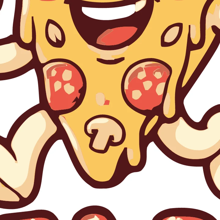
400 % zoom: edges stay sharp

At 16 px
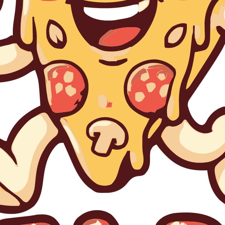
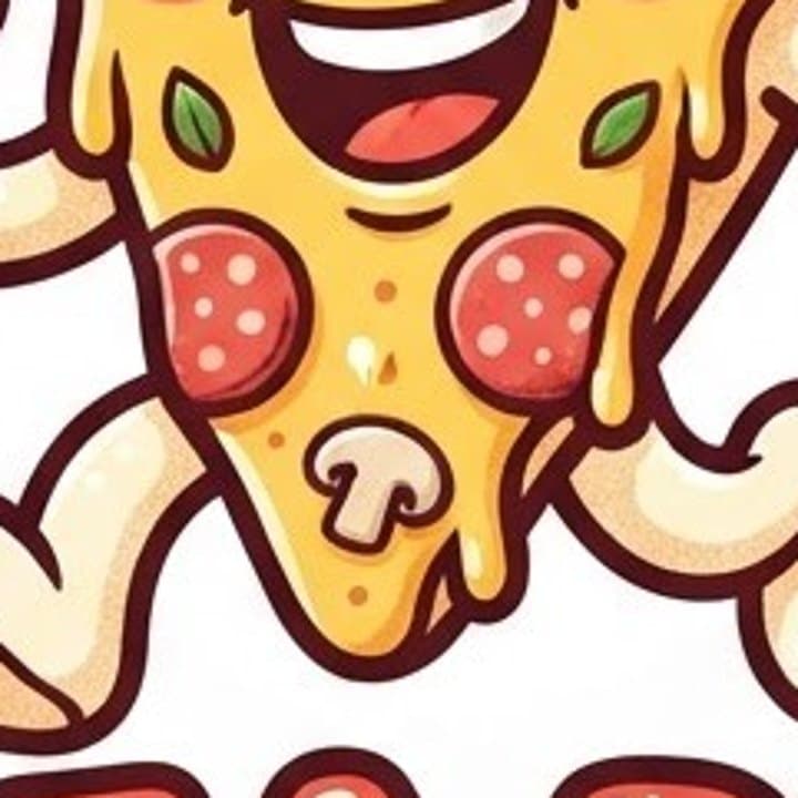
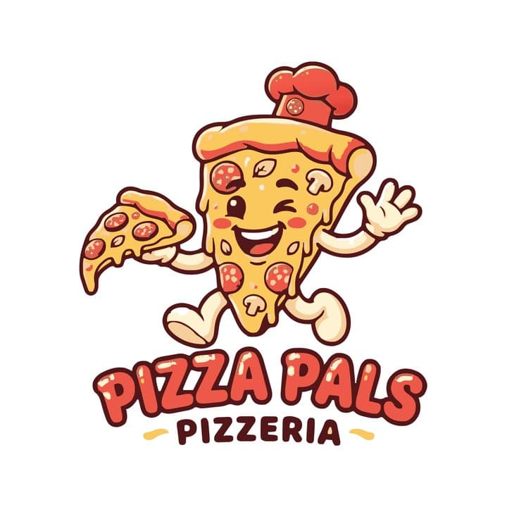
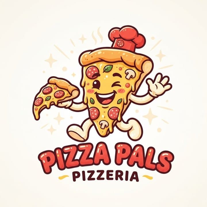
At 400 % the outlines of the pizza slice, the pepperoni and the mushroom are crisp, with flat fills and no steps: that is a real vector. At 16 px the same file is an orange smudge. That is not a tracing fault. A detailed mascot with a name under it has too much in it for a browser tab. Use the symbol alone for small places; the favicon guide shows how.
- Zoom: open the SVG in a browser tab and zoom to 400 % or more. Edges should stay sharp, without steps or blur.
- Colours: open it in a design tool and count the fills. A three-colour logo should have three, not forty shades of each.
- Small size: look at it at 16 and 32 px. If it turns into a smudge, you need a simpler symbol for favicons and avatars.
- Real paths: open the file in a text editor and search for <image. If it is there, the SVG contains a picture, not shapes. In a design tool you should be able to select separate shapes, not one rectangle.
PNG vs SVG: which to use where
Keep the SVG as the master file and make everything else from it. A PNG is still the right file wherever a platform asks for an image at a fixed size.
| Use | File | Why |
|---|---|---|
| Website header | SVG | Sharp on every screen, small file, can be recoloured with CSS. |
| Print shop, signs, merch | PDF or EPS | Print software expects them, and the shapes stay vector. |
| App store icon | PNG | Apple and Google ask for fixed-size PNGs, such as 1024 × 1024 px for the App Store. |
| Social media avatar | PNG | Platforms take PNG or JPG uploads, not SVG. |
| Design tools | SVG | Figma, Illustrator, Inkscape and Affinity open it as editable shapes. |
| Email signature | PNG | Many email clients block or do not show SVG. |
A good logo pack has both: the vector as the master file and PNGs rendered from it at the sizes you need. That is what Logobundle builds. For the exact sizes of home-screen icons, see app icons from a logo.
Fine-tuning the result
After the upload you can change the level of detail, sharpen corners for geometric logos and adjust how much of the background is removed, or untick background removal to keep it (useful for an app icon tile).
Each control matches one of the problems above. Detail runs from Simpler shapes to Keep small parts: move it down when a busy logo leaves specks, and up when thin parts or small letters go missing. Corners runs from Rounder to Sharper: geometric logos, letters and badges usually look best on the sharp side, hand-drawn marks on the round side. Background removal runs from Gentle to Strong: go stronger when bits of a shadow or paper stay behind, and gentler when the edge of the logo gets eaten.
Change one control at a time and compare. When the plain trace still struggles, as with the glow and watercolour uploads above, the AI boost in a paid pack is meant for exactly this: it redraws the art flat before the trace runs.
Try every file before you pay
- Previewevery image file, watermarked
- Free
- Logovectors, print, PNG
- €8.99
- Complete+ favicons, app icons, social
- €18.99
No account, ready in about a minute. Your image is only used to make your files, sits behind a private link and is deleted after 30 days.
Upload your logo image
A PNG, JPG or WebP: from an image generator, an old website or a scan. A plain or transparent background works best.
Preview the pack, free
Every image file, with a watermark. Try the favicon in your site and the icon on your phone.
Get it clean
Pay once, from €8.99: no watermark, the SVG vectors, and the AI boost, which redraws your logo flat and clean first. Prefer the plain trace? Untick it at checkout.
Pricing
Complete
€18.99 paid once
- AI boost: redrawn flat and clean before tracing
- SVG vectors that scale to any size
- Print-ready PDF and EPS
- Transparent PNGs, WebP and AVIF, black and white versions
- Favicons, touch icons, web manifest
- iOS, Android and desktop app icons
- Share images for links and profiles
- Die-cut sticker, 50, 75 and 100 mm
Logo
€8.99 paid once
- AI boost: redrawn flat and clean before tracing
- SVG vectors that scale to any size
- Print-ready PDF and EPS
- Transparent PNGs, WebP and AVIF, black and white versions
- Die-cut sticker, 50, 75 and 100 mm
No favicons, app icons or share images.
Free
€0 watermarked
Every image file with a watermark, to check the result. No vectors, preview only.
One-time payment. The AI boost is included; prefer the plain trace? Untick it at checkout.
Only need stickers? Sticker pack for €4.99 with print-shop, Cricut and Silhouette files and ready-made sheets.
Questions
- Is the SVG editable in Illustrator, Figma, Inkscape or Affinity?
- Yes. It is a standard SVG made of paths with flat fills (and linear gradients where the original had them). Every design tool opens it, and you can recolour or edit the shapes.
- Can I convert a JPG logo too?
- Yes. PNG, JPG and WebP up to 10 MB all work. JPG compression noise is mostly folded away by the colour reduction, but heavy artefacts around small text can survive, so check the result.
- Why does my SVG look blurry?
- Because it is not really a vector. Some converters put the original PNG inside an SVG file with an <image> tag, so it blurs exactly like the PNG. Open the file in a text editor and search for <image. If you find it, trace the logo properly in Inkscape, Illustrator or Logobundle.
- How many colours should a logo have for tracing?
- Two to six flat colours trace cleanly. More is possible, but near-identical shades from AI images or JPEG compression turn into patchy noise. Set the tracer's colour count (Scans in Inkscape, Colors in Illustrator) to the number of colours you can actually name (plus one for the background in Inkscape).
- Is a traced SVG as good as one drawn by a designer?
- Not quite. A designer redraws the logo with fewer, cleaner nodes and exact geometry, such as perfect circles and straight lines. For a flat logo, a good trace comes close and works for websites, print and icons. For a detailed or textured logo, a redraw is worth paying for.
More answers in the main FAQ.