 Logobundle
How to make app icons from your logo
Updated · 13 min read
To make app icons from your logo, export one opaque 1024 × 1024 px square for iOS, three 108 dp layers for Android (foreground, background and a one-colour layer for themed icons) with the art inside the central 66 dp, a 512 px icon for Google Play, and an .ico and an .icns file for Windows and macOS. Use the symbol of your logo rather than the name: on a home screen the icon is about a centimetre wide. This guide lists the sizes and rules per platform, shows the mistakes that cut or blacken an icon, and gives the settings for Expo, Flutter and Xcode. Logobundle builds the set from one upload. Only need the files? Use the app icon generator.
A real result
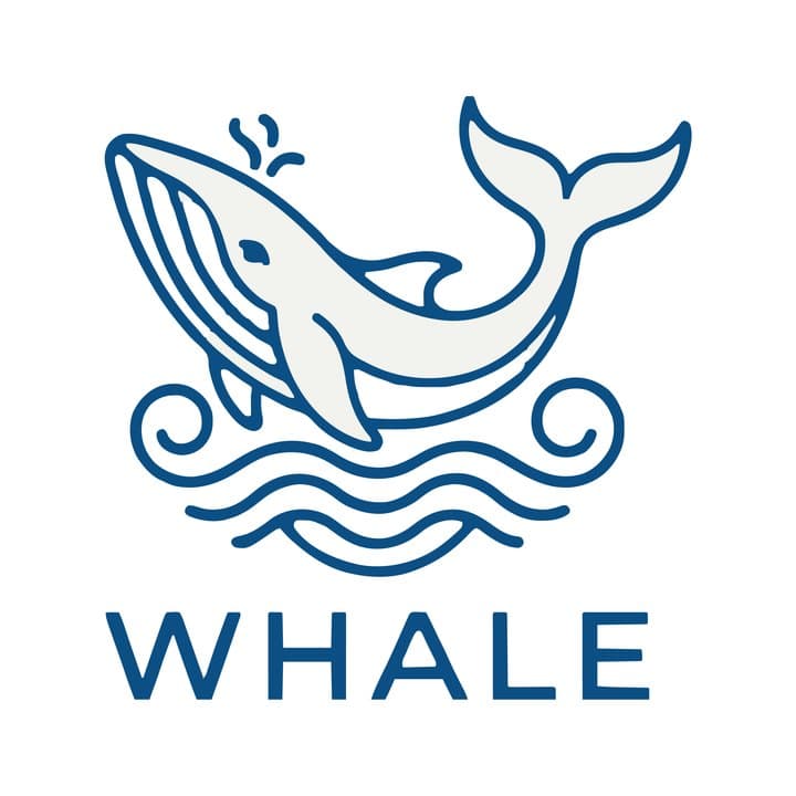
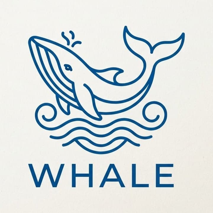
The app icons it made
The wordmark blurs at small sizes, so the icons use the whale alone. Shown as each platform masks them.

iOS

Android adaptive
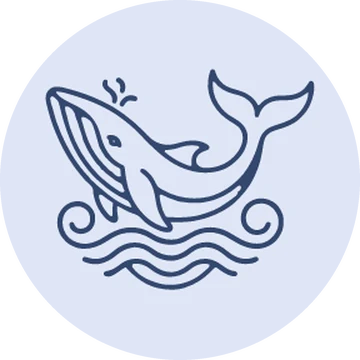
Android themed

Play Store
macOS .icns
On this page
App icon sizes per platform in 2026
Each platform wants its icon in a different size and shape, and each masks it in its own way. This is what you need for an app on the main platforms:
| Platform | File | Size | Rules |
|---|---|---|---|
| iOS and iPadOS | PNG | 1024 × 1024 px | Opaque, no alpha channel, square corners: iOS rounds them |
| Android adaptive icon | Foreground and background layers | 108 × 108 dp (432 px at xxxhdpi) | Art inside the central 66 dp; launchers show the inner 72 dp |
| Android themed icon | Monochrome layer | 108 × 108 dp | One colour; Android uses only its shape (Android 13 and later) |
| Google Play | 32-bit PNG | 512 × 512 px | Full square, no rounded corners or shadow, at most 1024 KB |
| macOS (before Tahoe) | .icns | 16 to 1024 px | The rounded tile is drawn into the file |
| Windows | .ico | 16 to 256 px | At least 16, 24, 32, 48 and 256 px in one file |
Apple changed its icon system in 2025. With iOS 26 and macOS Tahoe, icons get the Liquid Glass look, and Xcode 26 includes Icon Composer, a tool that builds one layered .icon file for all of Apple's platforms. Such an icon can appear in several styles: default, dark, clear and tinted, the last two in light and dark versions.
A flat PNG still works. Apple's Xcode documentation says iOS apps can generate every icon size from a single 1024 × 1024 px image, and that is still the default for a new icon. You can add your own dark and tinted versions, or let the system make them from your icon. Icon Composer is optional: use it when you want control over the glass layers.
Logobundle's Complete pack has the flat files from this table: app-icons/ios/icon-1024.png, the three Android layers at 432 px, playstore-512.png, and icon.ico, icon.icns and 256 and 512 px PNGs in app-icons/desktop/. It does not contain an Icon Composer file or separate dark and tinted iOS icons.
iOS: one opaque square
The iOS icon is a full square with no transparency and no rounded corners. iOS cuts the corners itself, so corners you draw in end up as a smaller tile with a thin edge inside the system's shape.

Opaque square, symbol only

Transparent PNG, filled black
Logos are often exported with a transparent background, and that is the problem on the right. Xcode and App Store Connect refuse a 1024 px App Store icon that has an alpha channel; the error reads "Invalid large app icon". Where a transparent icon still reaches a device, for example in a test build, the transparent parts are widely reported to show as black. The whale's dark blue lines and its name then lose most of their contrast; only the pale body stands out.
The fix is a solid background colour, filled to the edges, and the file saved without an alpha channel. A plain white or brand-colour square is fine. The one exception is the optional dark icon: Apple asks for that one with a transparent background, so the system's own dark background shows through.
Logobundle's icon-1024.png has no alpha channel. The art takes up 72 % of the square, on white or near-black, whichever the logo's outline reads better on, or on the logo's own tile colour if your logo is a tile. That leaves room for the rounded corners. For the whale it used the symbol alone; Logos with text explains when.
Android adaptive icons and the safe zone
An Android adaptive icon is two layers, a foreground with the art and a background, each 108 × 108 dp. The launcher shows only the inner 72 dp and cuts it to a circle, a squircle, a square or another shape set by the phone maker. The outer 18 dp on each side is there for effects such as parallax and pulsing. Only the central 66 dp is never cut, so your logo has to fit inside it.
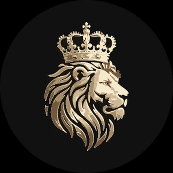
Art inside the safe zone
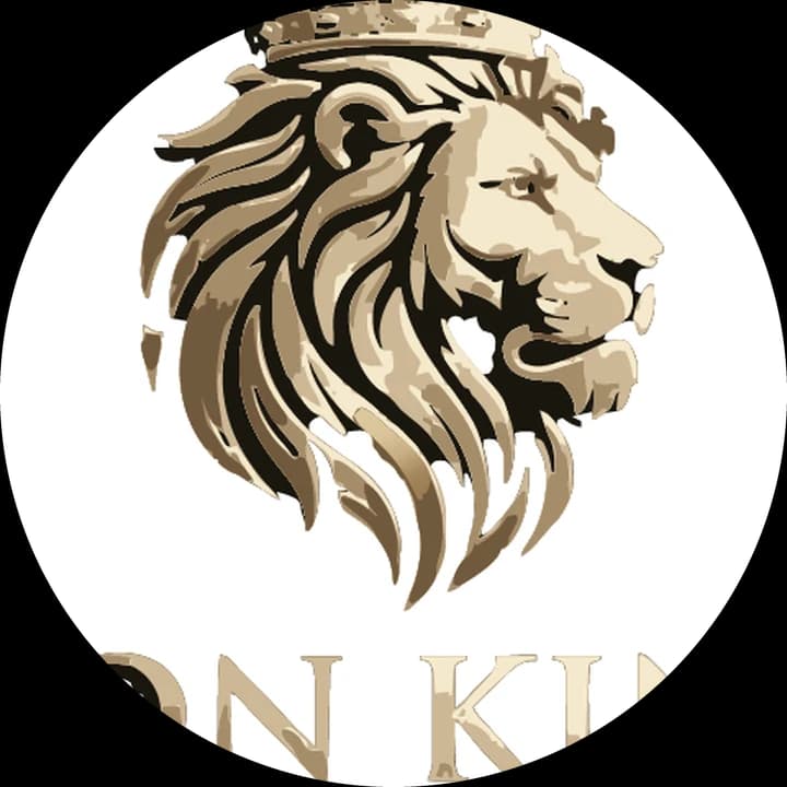
Logo across the whole layer
On the right, the logo fills the whole layer, as it would if you used your square logo file as the foreground. The circle cuts off the top of the crown, and of the name "LION KING" only the broken letters "ON KI" remain at the bottom edge. A squircle mask would cut less, a smaller circle more: you cannot know which shape a phone uses.
On the left, the art is shrunk into the middle of the layer and the whole crown and mane are visible, with space all round. Logobundle's adaptive-foreground-432.png draws the art across the middle half of the layer, 54 of the 108 dp, which is inside the 66 dp safe zone. The background layer is one solid colour. For the lion it used the symbol without the name; the dark background is the near-black that the gold art reads better on.
432 px is the 108 dp layer at the highest density (xxxhdpi, 4 px per dp). Android Studio, Expo and flutter_launcher_icons can make the smaller densities from it.
Upload your logo and preview its iOS, Android and themed icons for free.
Themed icons: the monochrome layer
Since Android 13, people can turn on themed icons. The launcher then draws every app icon in one colour taken from the wallpaper, on a matching pale or dark background. For this it needs a third layer, the monochrome layer: the same art in one colour on transparency, also 108 dp with the art in the safe zone.
Android uses only the shape of this layer, not its colours. Anything that depends on colour or shading to be seen disappears. An app without a monochrome layer keeps its normal colour icon among the themed ones. According to Android's documentation, Android 16 QPR 2 and later theme such icons automatically, so it is better to supply your own layer than to let the system guess.
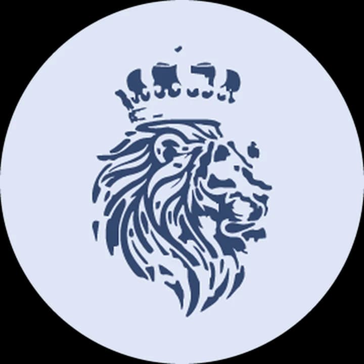
Themed icon, as a launcher tints it
The lion shows what happens to detailed art. In colour, the gold shading holds the crown and mane together. As one flat colour, the crown breaks into separate blobs and the mane into loose patches. It still reads as a crowned lion, but only just. A simpler symbol, or one drawn with solid shapes, makes a better themed icon.
Logobundle's adaptive-monochrome-432.png is made from the pack's black version of the same art (the symbol, when the icons use it), drawn in white on transparency at the same size and position as the foreground. It does not simplify the art, so check it at home-screen size before you ship.
macOS and Windows icons
Before macOS Tahoe, macOS showed an .icns file exactly as drawn, with no mask of its own. That is why Mac icons carry their shape in the file: Apple's template is a rounded square of 824 px on a 1024 px canvas, with transparent space around it.
Logobundle's icon.icns follows that template: the art on a rounded tile of 824 px with a corner radius of 185.4 px, centred on a transparent 1024 px canvas. The file holds frames from 32 to 1024 px.
macOS Tahoe (macOS 26) changed this. It expects icons in its own rounded-square shape, and reports from Mac users and the press describe how it shrinks icons that do not fit and puts them on a grey tile. We have not tested how Tahoe shows our .icns. For an app that targets Tahoe, build the icon in Icon Composer: it can take the SVG of your logo as a layer, and Xcode then makes the Mac icon from the same .icon file as the iPhone one.
Windows looks for an exact size first and otherwise scales down from the next larger one. Microsoft's minimum for an .ico is 16, 24, 32, 48 and 256 px; the 256 px frame means Windows only ever scales down. Logobundle's icon.ico holds 16, 24, 32, 48, 64, 128 and 256 px frames, all scaled down from one 256 px render, on a transparent background (or on the tile, if your logo is one). Apps packaged as MSIX for the Microsoft Store need separate PNG files named by size and theme instead; the pack does not include those.
Logos with text
An iPhone shows a home-screen icon at about 60 points, which is 120 or 180 pixels depending on the screen. Text that is easy to read in your logo file becomes a few pixels tall at that size. The two icons below are drawn at 120 px and enlarged pixel for pixel.

Symbol only, 120 px

Whole logo, 120 px
The whale fills the square and keeps its shape, although the thin lines of the spout and waves are only a pixel or two wide. The Hammer and Home icon has to fit the house, the hammer, two lines of name and a tagline into the same square. The house and hammer take the top third, "HAMMER AND HOME" is still readable, and "CONSTRUCTION & RENOVATION" becomes a blur of pixels. On the phone, at about a centimetre wide, the name is hard to read too.
Logobundle checks how much detail the whole logo loses at small sizes. If it loses too much and the logo has a separate symbol that holds up better, the favicons and app icons use the symbol alone, and the pack's README says so. It did that for the whale, though its README still calls the symbol too detailed for 16–48 px. For Hammer and Home it kept the whole logo, and the README warns that its text and fine lines will blur at favicon sizes and suggests the symbol alone. In that case, crop the symbol yourself, or make a simple monogram, and run that through Logobundle for the icons. The favicon guide shows the same problem at 16 px.
Uploading a finished icon: a full square in one flat colour, without rounded corners? Untick "Remove the background" after the upload so that colour becomes the icon's background.
Use the icons in Expo, Flutter and Xcode
The files are plain PNG, ICO and ICNS images, so every toolchain can use them. Copy them into your project, for example into assets/icons/, and point the configuration at them.
Expo (app.json)
{
  "expo": {
    "icon": "./assets/icons/icon-1024.png",
    "ios": {
      "icon": "./assets/icons/icon-1024.png"
    },
    "android": {
      "adaptiveIcon": {
        "foregroundImage": "./assets/icons/adaptive-foreground-432.png",
        "backgroundImage": "./assets/icons/adaptive-background-432.png",
        "monochromeImage": "./assets/icons/adaptive-monochrome-432.png"
      }
    }
  }
}Make a new native build afterwards: icons are part of the app binary, so an over-the-air update does not change them.
Flutter (flutter_launcher_icons)
flutter_launcher_icons:
  image_path: "assets/icons/icon-1024.png"
  android: true
  ios: true
  remove_alpha_ios: true
  adaptive_icon_foreground: "assets/icons/adaptive-foreground-432.png"
  adaptive_icon_background: "assets/icons/adaptive-background-432.png"
adaptive_icon_monochrome: "assets/icons/adaptive-monochrome-432.png"The package makes every Android density and iOS size from these files. remove_alpha_ios is a safety net; Logobundle's iOS icon has no alpha channel already.
Xcode and Android Studio
In Xcode, open Assets.xcassets, select AppIcon, and in the Attributes inspector set iOS to Single Size. Drag icon-1024.png into the image well. Xcode makes all smaller sizes from it.
In Android Studio, Image Asset Studio (right-click res, then New → Image Asset) takes the foreground and background layers and writes the density folders and the adaptive-icon XML. Check that the monochrome layer ends up in the XML too. For Google Play, upload playstore-512.png in Play Console. Google's spec asks for a 32-bit PNG, and Logobundle's file has no alpha channel; if Play Console refuses it, save it again with one, for example with ImageMagick: magick playstore-512.png PNG32:playstore-512.png.
Make app icons by hand
You need a vector version of your logo first. If you only have a PNG, convert the PNG logo to SVG; if it came from Gemini, the Gemini guide shows how to clean it up before tracing.
- 1Download Apple's app icon templates for Figma or Sketch from Apple Design Resources, and get Icon Composer if you want a Liquid Glass icon.
- 2Place the symbol on a solid square of 1024 px for iOS, leaving room for the rounded corners. Export it as PNG without transparency.
- 3For Android, make a 108 dp (432 px) frame and keep the art inside the central 66 dp. Android Studio's Image Asset Studio shows the safe zone and previews the masks.
- 4Make the monochrome layer: the art in one colour on transparency, in the same position as the foreground.
- 5Export the 512 px Play Store icon as a full square, and the .ico and .icns with the commands below.
# Windows .ico from a square icon.svg
for s in 16 24 32 48 64 128 256; do rsvg-convert -w $s icon.svg -o $s.png; done
magick 16.png 24.png 32.png 48.png 64.png 128.png 256.png icon.ico

# macOS .icns (on a Mac), from a 1024 px PNG with the tile drawn in
mkdir icon.iconset
for s in 16 32 128 256 512; do
  sips -z $s $s mac-1024.png --out icon.iconset/icon_${s}x${s}.png
  sips -z $((s*2)) $((s*2)) mac-1024.png --out icon.iconset/icon_${s}x${s}@2x.png
done
iconutil -c icns icon.iconsetDoing it by hand is better when the icon is not simply your logo on a square: a custom tile with a gradient or texture, a symbol redrawn to be bolder at small sizes, separate dark and tinted iOS versions, or a layered Liquid Glass icon. A generator places your logo on a plain background; it does not design an icon.
Try every file before you pay
- Previewevery image file, watermarked
- Free
- Logovectors, print, PNG
- €8.99
- Complete+ favicons, app icons, social
- €18.99
No account, ready in about a minute. Your image is only used to make your files, sits behind a private link and is deleted after 30 days.
Upload your logo image
A PNG, JPG or WebP: from an image generator, an old website or a scan. A plain or transparent background works best.
Preview the pack, free
Every image file, with a watermark. Try the favicon in your site and the icon on your phone.
Get it clean
Pay once, from €8.99: no watermark, the SVG vectors, and the AI boost, which redraws your logo flat and clean first. Prefer the plain trace? Untick it at checkout.
Pricing
Complete
€18.99 paid once
- AI boost: redrawn flat and clean before tracing
- SVG vectors that scale to any size
- Print-ready PDF and EPS
- Transparent PNGs, WebP and AVIF, black and white versions
- Favicons, touch icons, web manifest
- iOS, Android and desktop app icons
- Share images for links and profiles
- Die-cut sticker, 50, 75 and 100 mm
Logo
€8.99 paid once
- AI boost: redrawn flat and clean before tracing
- SVG vectors that scale to any size
- Print-ready PDF and EPS
- Transparent PNGs, WebP and AVIF, black and white versions
- Die-cut sticker, 50, 75 and 100 mm
No favicons, app icons or share images.
Free
€0 watermarked
Every image file with a watermark, to check the result. No vectors, preview only.
One-time payment. The AI boost is included; prefer the plain trace? Untick it at checkout.
Only need stickers? Sticker pack for €4.99 with print-shop, Cricut and Silhouette files and ready-made sheets.
Questions
- Does it work with Expo, Flutter and React Native?
- Yes. The files are plain PNG, ICO and ICNS images at the standard sizes, so you can point Expo's app.json, flutter_launcher_icons or Xcode and Android Studio at them. Use the icons has the settings.
- Which pack has the app icons?
- The Complete pack. The Logo pack has the logo files themselves (SVG, PDF, EPS, PNG, WebP, AVIF) but no icons or social images.
- Why is my iOS icon black?
- The PNG has a transparent background. Apple's tools refuse an App Store icon with an alpha channel, and where a transparent icon reaches a device, the transparent parts are widely reported to show as black. Fill the background with a solid colour and save the PNG without an alpha channel. iOS: one opaque square shows the difference.
- Can I use the same icon for iOS and Android?
- The same art, yes, but not the same file. iOS wants one opaque 1024 px square with the art filling most of it. Android wants separate foreground and background layers with the art inside the central 66 of 108 dp, or a launcher cuts it off. The 512 px Play Store icon is a third file.
More answers in the main FAQ.